Location:
ChenDianHu Industrial Area, GanZhe Town, Minhou County,
Fuzhou City, Fujian Province, China
teruiermirror
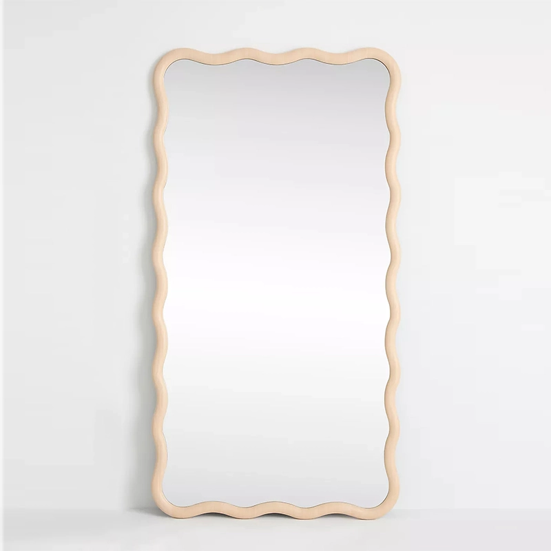
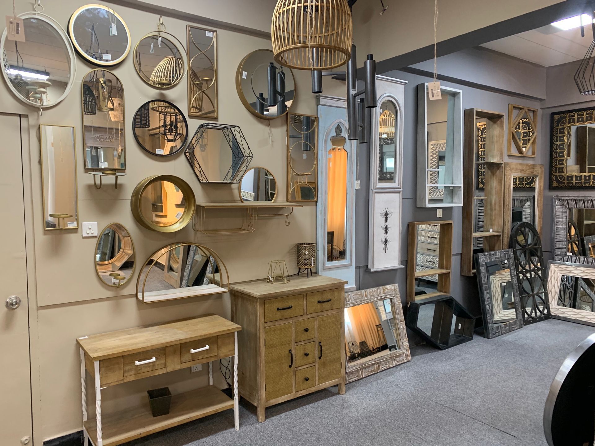
Customers Choose Faster When the Store Makes the Comparison Easier
26-04-29 2 view
Customers Choose Faster When the Store Makes the Comparison Easier A lot of mirror sales do not stop at “Do I want this?” They stop at: “Which one should I choose?” That is a different kind of hesitation. In many community home stores, the customer is already interested. They already know they want a mirror for the entryway, bedroom, or living room. The problem is that two or three mirrors feel close enough that the decision starts getting heavy. One is round.One is arched.One is a little larger.One looks easier.One feels more decorative.One costs a bit more. The customer stands there comparing in silence. And when the store does not help, the customer often delays the purchase. That is why compare displays and compare cards matter so much in a mirror section. They do not push the customer. They reduce decision friction. A compare card is not just a label It is a decision tool. A standard tag tells the customer what the mirror is.A compare card helps the customer understand why this mirror is different from the one next to it. That is the real job. For a community home store, this is especially useful because mirrors are often bought through practical comparison: easier vs stronger smaller vs more room-defining decorative vs more flexible entryway-friendly vs living-room-ready easy full-length vs more statement full-length These are not technical debates. They are buying decisions. A compare card gives the customer a cleaner way to make them. Not every mirror needs to be compared side by side This is important. A store should not turn the whole mirror wall into a comparison chart. Compare displays work best when: two or three mirrors are genuinely close alternatives customers often pause between similar options the price difference needs explanation the room role is similar, but the product role is different the store wants to guide a step-up decision without pressure The goal is not to make the whole section feel analytical. The goal is to use comparison only where comparison helps the sale move forward. Which mirrors are best for side-by-side comparison Some mirror pairings naturally create useful decisions. 1. Same room, different shape This is one of the easiest and strongest compare setups. Example: round entryway mirror arch entryway mirror The customer is not choosing between two unrelated products. They are choosing between two ways of solving the same room. A compare card can clarify: round = cleaner, easier, more flexible arch = softer, more styled, more shape-led That makes the decision easier without making either mirror sound “better” in an absolute way. 2. Same room, different scale This is useful when two mirrors work in the same kind of space, but one…
Customers Choose Faster When the Store Makes the Comparison Easier
Customers Choose Faster When the Store Makes the Comparison Easier
Customers Choose Faster When the Store Makes the Comparison Easier
A lot of mirror sales do not stop at “Do I want this?”
They stop at: “Which one should I choose?”
That is a different kind of hesitation.
In many community home stores, the customer is already interested. They already know they want a mirror for the entryway, bedroom, or living room. The problem is that two or three mirrors feel close enough that the decision starts getting heavy.
One is round. One is arched. One is a little larger. One looks easier. One feels more decorative. One costs a bit more.
The customer stands there comparing in silence.
And when the store does not help, the customer often delays the purchase.
That is why compare displays and compare cards matter so much in a mirror section. They do not push the customer. They reduce decision friction.
A compare card is not just a label
It is a decision tool.
A standard tag tells the customer what the mirror is. A compare card helps the customer understand why this mirror is different from the one next to it.
That is the real job.
For a community home store, this is especially useful because mirrors are often bought through practical comparison:
easier vs stronger
smaller vs more room-defining
decorative vs more flexible
entryway-friendly vs living-room-ready
easy full-length vs more statement full-length
These are not technical debates. They are buying decisions.
A compare card gives the customer a cleaner way to make them.
Not every mirror needs to be compared side by side
This is important.
A store should not turn the whole mirror wall into a comparison chart.
Compare displays work best when:
two or three mirrors are genuinely close alternatives
customers often pause between similar options
the price difference needs explanation
the room role is similar, but the product role is different
the store wants to guide a step-up decision without pressure
The goal is not to make the whole section feel analytical.
The goal is to use comparison only where comparison helps the sale move forward.
Which mirrors are best for side-by-side comparison
Some mirror pairings naturally create useful decisions.
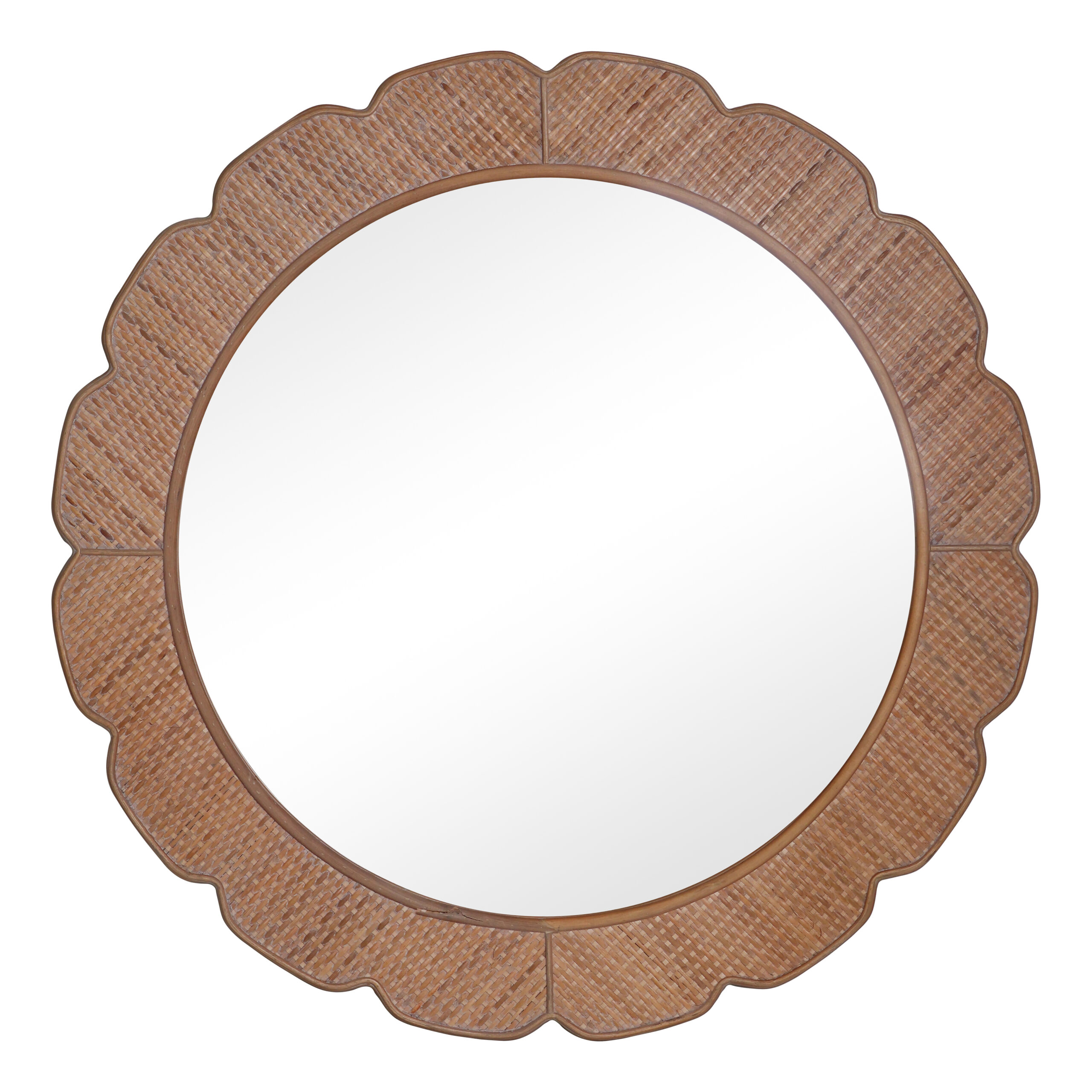
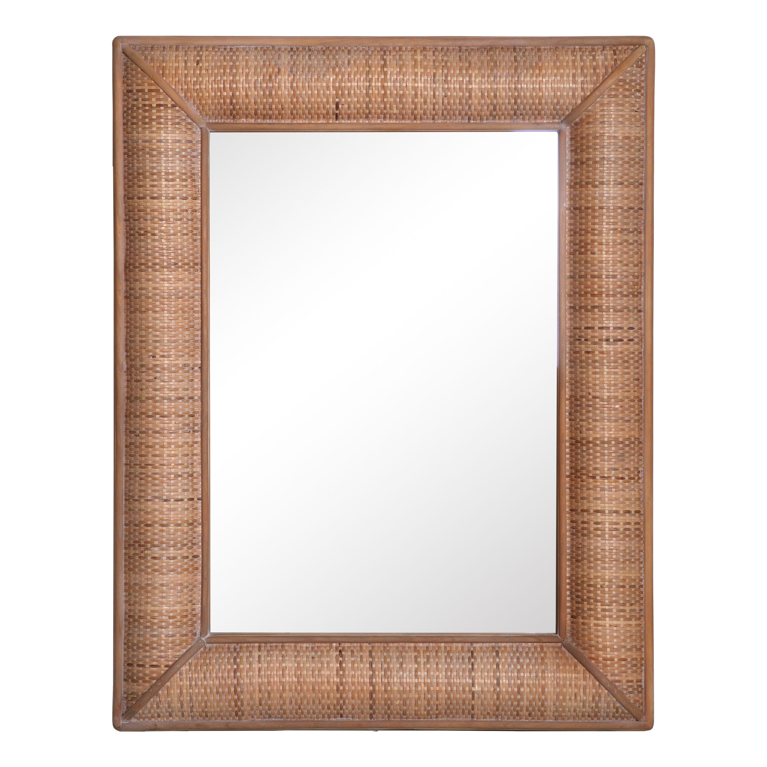
1. Same room, different shape
This is one of the easiest and strongest compare setups.
Example:
round entryway mirror
arch entryway mirror
The customer is not choosing between two unrelated products. They are choosing between two ways of solving the same room.
A compare card can clarify:
round = cleaner, easier, more flexible
arch = softer, more styled, more shape-led
That makes the decision easier without making either mirror sound “better” in an absolute way.
2. Same room, different scale
This is useful when two mirrors work in the same kind of space, but one is safer and one does more visual work.
Example:
medium wall mirror
larger wall mirror
A compare card can clarify:
medium = easier to place, easier for smaller homes
larger = better when the wall still feels unfinished
This is one of the most commercially useful comparisons because it helps the customer decide whether they want lower risk or stronger room impact.
3. Same style direction, different price band
This is where compare cards become especially valuable.
When two mirrors feel related but one costs more, the store should not wait for confusion.
Example:
simple black-framed mirror
stronger framed black mirror
A compare card can explain:
simpler option = everyday flexibility
step-up option = more wall-finishing presence
Now the higher-ticket mirror feels intentional, not random.
4. Same role, different mood
Some mirrors solve the same problem but create a different room feeling.
Example:
clean rectangular bedroom mirror
softer arch bedroom mirror
A compare card can clarify:
rectangle = more practical, more structured
arch = softer, more decorative, more mood-led
This is useful because many customers know the room they are shopping for, but not the emotional tone they want yet.
5. Smaller easy-buy option vs bigger room-anchor option
This is another strong compare moment.
Example:
compact decorative mirror
larger statement wall mirror
A compare card can explain:
smaller = easier first mirror, easier to carry, easier to place
larger = better when the mirror needs to do more of the room’s work
This helps the store serve both cautious buyers and step-up buyers without making either choice feel wrong.
What should not be compared together
Bad comparison creates confusion, not clarity.
Some mirrors do not belong in the same compare setup:
an entryway mirror vs a full-length bedroom mirror
a giftable small mirror vs a large living room mirror
a highly seasonal novelty piece vs a year-round core mirror
mirrors that solve different rooms with no obvious overlap
products too far apart in purpose, size, or price to feel like real alternatives
A compare display should feel natural.
The customer should look at the two mirrors and immediately understand: “Yes, I can see why the store is helping me choose between these.”
If that feeling is missing, the comparison is probably weak.
The best compare displays help customers choose between good options
This is a subtle but important point.
A compare card should not sound like:
this one is better
that one is worse
buy the expensive one
skip the simple one
That is clumsy retail language.
A stronger compare system shows:
what each mirror is good at
what kind of room or customer each one suits
when a step-up makes sense
when the simpler choice is actually the smarter choice
That kind of structure builds trust.
And in community home stores, trust often matters more than aggressive upselling.
A good compare card usually answers three things
A compare card works best when it helps the customer see:
what is different
who each option suits
when to choose one over the other
That is enough.
For example:
Round vs Arch Entryway Mirror Round: Easier to place, cleaner shape, good for tighter spaces Arch: Softer look, more styling presence, better when you want the mirror to carry more character
This is clear, fast, and useful.
The strongest compare cards use real buying language, not design-school language
That matters.
Customers respond better to:
easier to place
better for smaller homes
does more of the wall’s work
safer first choice
more decorative presence
stronger room-finisher
easier above a console
better when the space still feels unfinished
They respond less strongly to language like:
sculptural silhouette
elevated aesthetic
refined visual balance
premium decorative presence
Those phrases may sound polished, but they often do less work on the sales floor.
A compare card should help customers buy, not impress them with vocabulary.
What a simple compare card format can look like
A strong format is usually short.
Format 1: Side-by-side role comparison
Which one is easier? Mirror A: Easier to place, better for smaller entryways Mirror B: Better if you want more shape and a stronger first impression
Format 2: Safer vs stronger
Safer Choice vs Stronger Choice Safer Choice: Works in more homes, lighter on the wall Stronger Choice: Better when the mirror needs to anchor the room
Format 3: Everyday vs step-up
Everyday Option vs Step-Up Option Everyday: Practical, flexible, easy to live with Step-Up: More decorative, more wall presence, better for bigger moments
These formats are easy for stores to repeat across multiple compare situations.
Compare cards are especially useful in three parts of the mirror section
1. Entryway mirrors
Customers often hesitate between two entryway mirrors because both feel plausible.
Compare cards can help answer:
cleaner vs softer
smaller vs wider
easier vs more decorative
2. Full-length mirrors
This category often carries transport, placement, and price hesitation.
Compare cards can help answer:
slimmer vs stronger
easier everyday option vs more room-defining piece
simpler frame vs more decorative frame
3. Living room wall mirrors
Customers often need help understanding when to choose a mirror that does more visual work.
Compare cards can help answer:
quiet wall-finisher vs statement wall-finisher
easier scale vs larger scale
flexible choice vs stronger style choice
Compare cards also help explain price without sounding defensive
This is one of their biggest commercial benefits.
If two mirrors sit near each other and one is priced higher, the store should not let the customer guess the reason.
A compare card can make it feel natural:
Why is this one more? Option A: Better for easy placement and everyday flexibility Option B: Better when the mirror needs to carry more of the room and finish a larger wall
Now the store is not “defending” the higher price.
It is explaining the higher role.
That is a much stronger selling move.
Staff can use compare cards to start better conversations
This is another reason the system works.
A compare card gives staff a natural entry point.
Instead of saying:
“These are both good.”
They can say:
“This one is usually the easier choice if you want something flexible. This one makes more sense if the mirror needs to do more of the room’s work.”
Or:
“If you are not sure, think of this one as the safer fit and this one as the more shape-led fit.”
That kind of language feels helpful, not pushy.
It also saves staff from having to invent a comparison from scratch every time.
Compare cards are useful because mirrors are often “almost” the same to customers
Retailers see details fast. Customers often do not.
A store owner may instantly see the difference between:
a more open arch and a tighter arch
a lighter frame and a stronger frame
a practical round mirror and a more decorative round mirror
But to the customer, these can initially feel very close.
That is exactly where compare cards help.
They translate subtle product differences into practical room differences.
And room differences are easier to buy from than product details.
What compare cards should not do
They should not overwhelm
If the card looks like a product matrix, it is too heavy for the sales floor.
They should not sound judgmental
Do not imply one mirror is the “wrong” choice.
They should not rely only on specs
Size matters, but role matters more.
They should not repeat empty adjectives
“Elegant” vs “stylish” is not a useful comparison.
They should not compare too many mirrors at once
Two is best. Three can work occasionally. More than that usually slows the decision.
A compare display should make the category feel easier, not more complicated
This is the main rule.
If the customer leaves the compare setup feeling:
more confident
less confused
clearer on room fit
clearer on why one costs more
clearer on what kind of buyer they are in this moment
then the compare card is doing its job.
If they leave feeling like they just read a mini buying guide and still do not know what to do, the compare system needs simplifying.
Good compare questions to build cards around
A community home store can build strong compare cards around questions like:
Which one is easier to place?
Which one is better for smaller homes?
Which one does more of the wall’s work?
Which one is the safer first choice?
Which one feels more decorative?
Which one makes more sense for an entryway?
Which one is better if I want the mirror to anchor the room?
Why does this one cost more?
These are real floor questions.
That is why they work.
Example compare card ideas for community home stores
Example 1: Entryway Round vs Entryway Arch
Which one should I choose? Round: Cleaner look, easier above a narrow console Arch: Softer shape, better if you want more character near the front of the home
Example 2: Medium Wall Mirror vs Larger Wall Mirror
Safer vs Stronger Medium: Easier for smaller homes and everyday placement Larger: Better when the wall still feels unfinished and needs more structure
Example 3: Simple Full-Length vs Decorative Full-Length
Everyday vs More Styled Simple: Easier to live with, easier in bedrooms and dressing corners Decorative: Better when the mirror needs to bring more mood into the room
Example 4: Easy Entry Mirror vs Step-Up Entry Mirror
Which one fits your room better? Easy Entry: Better for compact spaces and lower-risk buying Step-Up Entry: Better when you want the mirror to feel more like a main feature
FAQ
What kind of mirrors should be compared side by side in a store?
Mirrors should be compared when they solve a similar room problem but offer different strengths, such as easier vs more decorative, smaller vs larger, or everyday vs step-up.
How many mirrors should one compare card cover?
Two mirrors is usually best. Three can work in some cases, but more than that often makes the comparison harder to read.
What is the biggest mistake in mirror compare displays?
Comparing products that are too different in room role, size, or price. A useful compare display should feel natural and relevant.
Should compare cards include technical specs?
Only lightly. The main goal is to explain room fit, choice logic, and buying confidence, not to turn the display into a spec sheet.
Why are compare cards useful in community home stores?
Because they reduce hesitation at the exact moment customers are trying to choose between two plausible options.
Can compare cards help sell higher-priced mirrors?
Yes. They help explain why a higher-priced mirror has a different role, which makes the step-up feel more understandable and less arbitrary.
A good compare card does not create more thinking
It creates clearer thinking.
That is the point.
For a community home store, mirror comparison should feel like a helpful shortcut, not a complicated retail exercise. The customer already likes the category. The store’s job is to make the final choice lighter.
This one is easier. That one does more. This one is safer. That one gives the room more presence.
When the store says those things clearly, the mirror section becomes easier to shop, easier to trust, and easier to buy from.
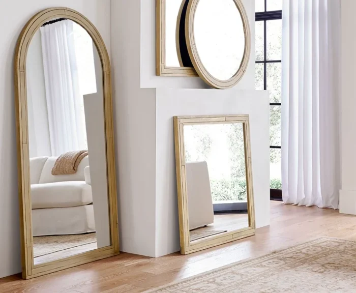
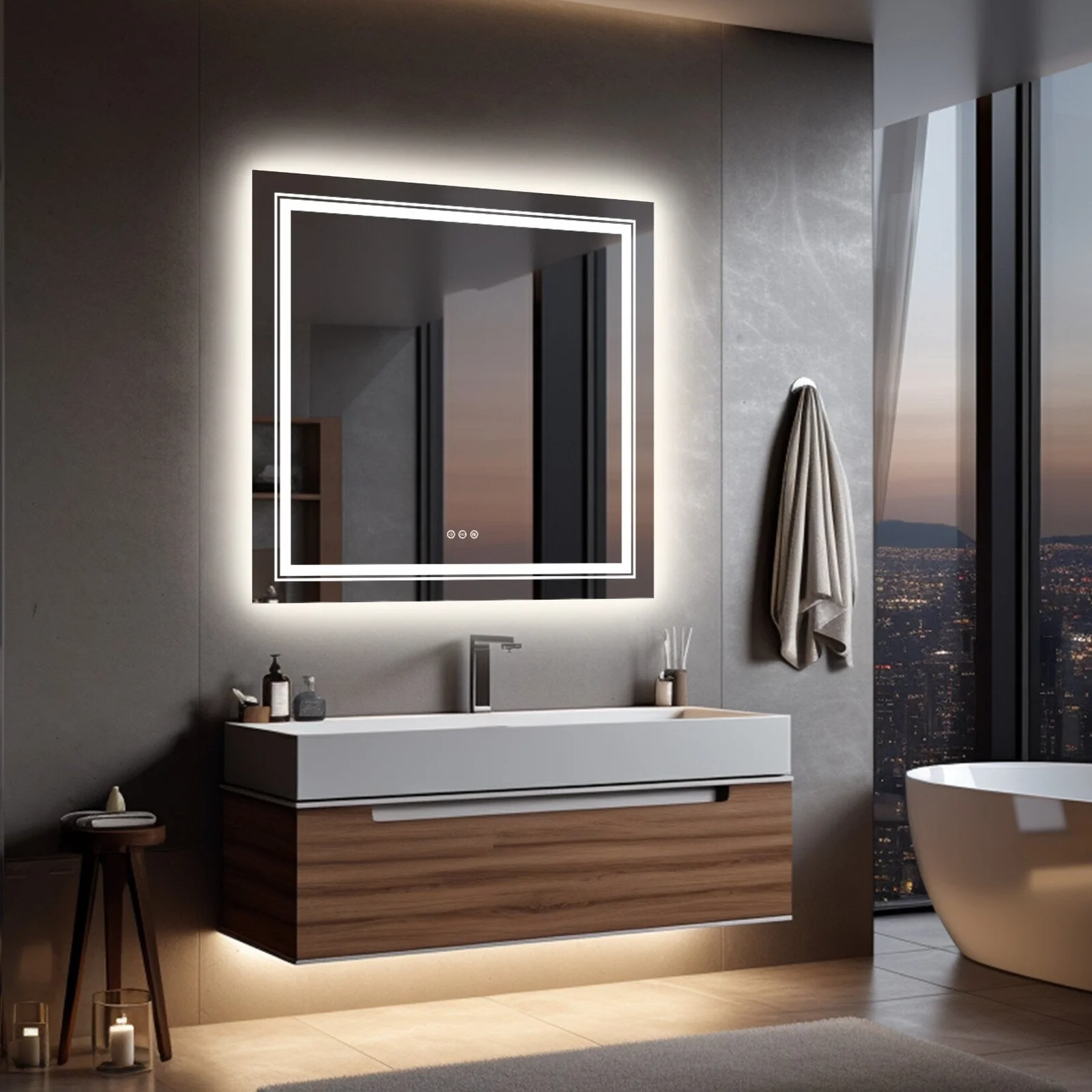
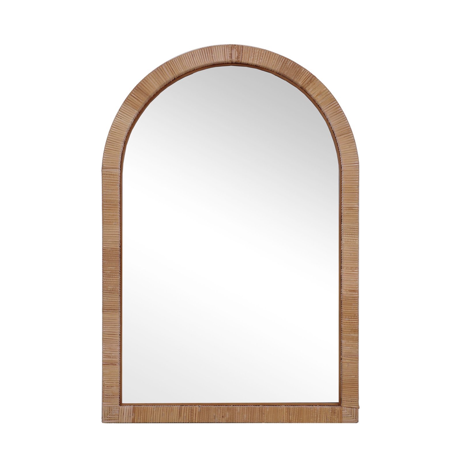
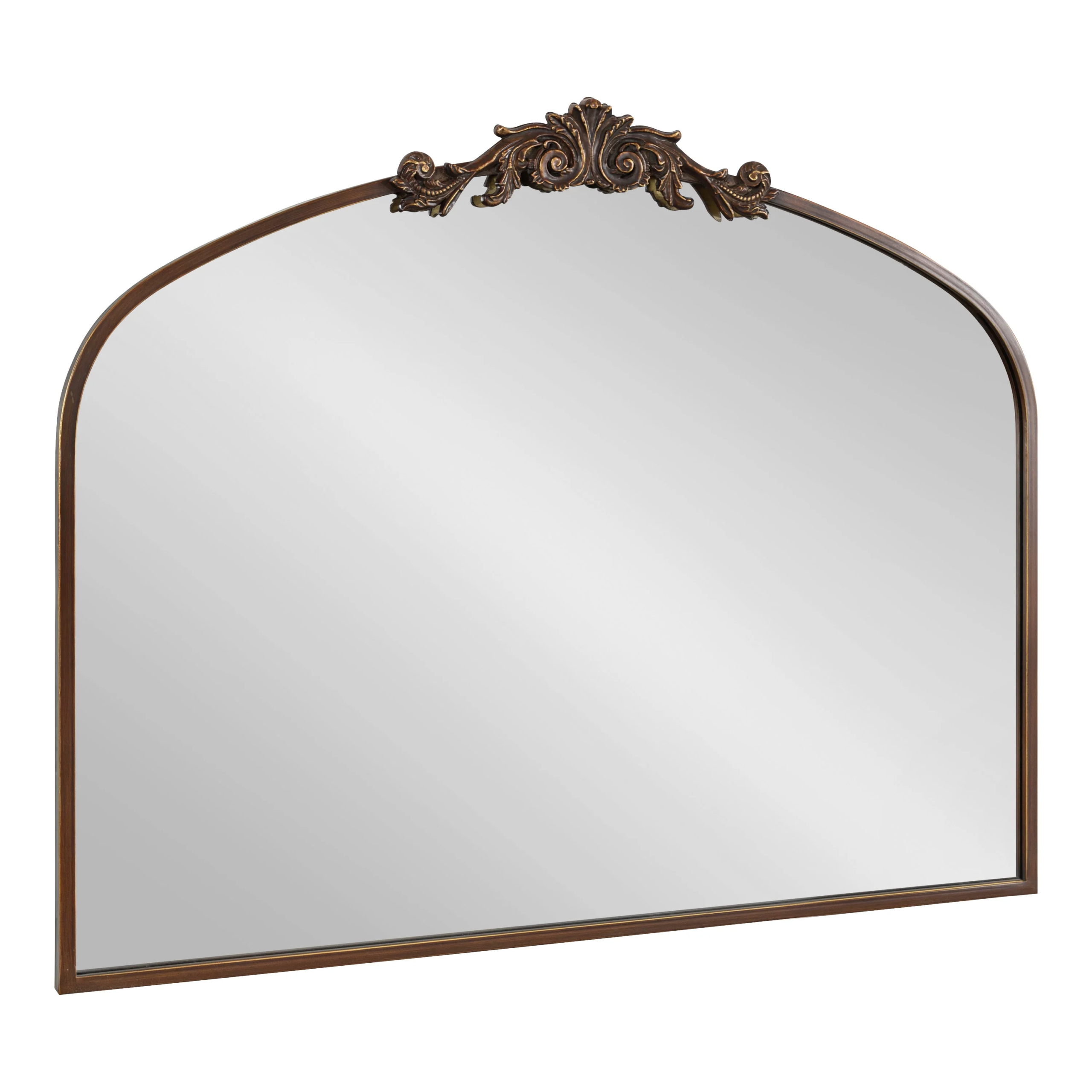
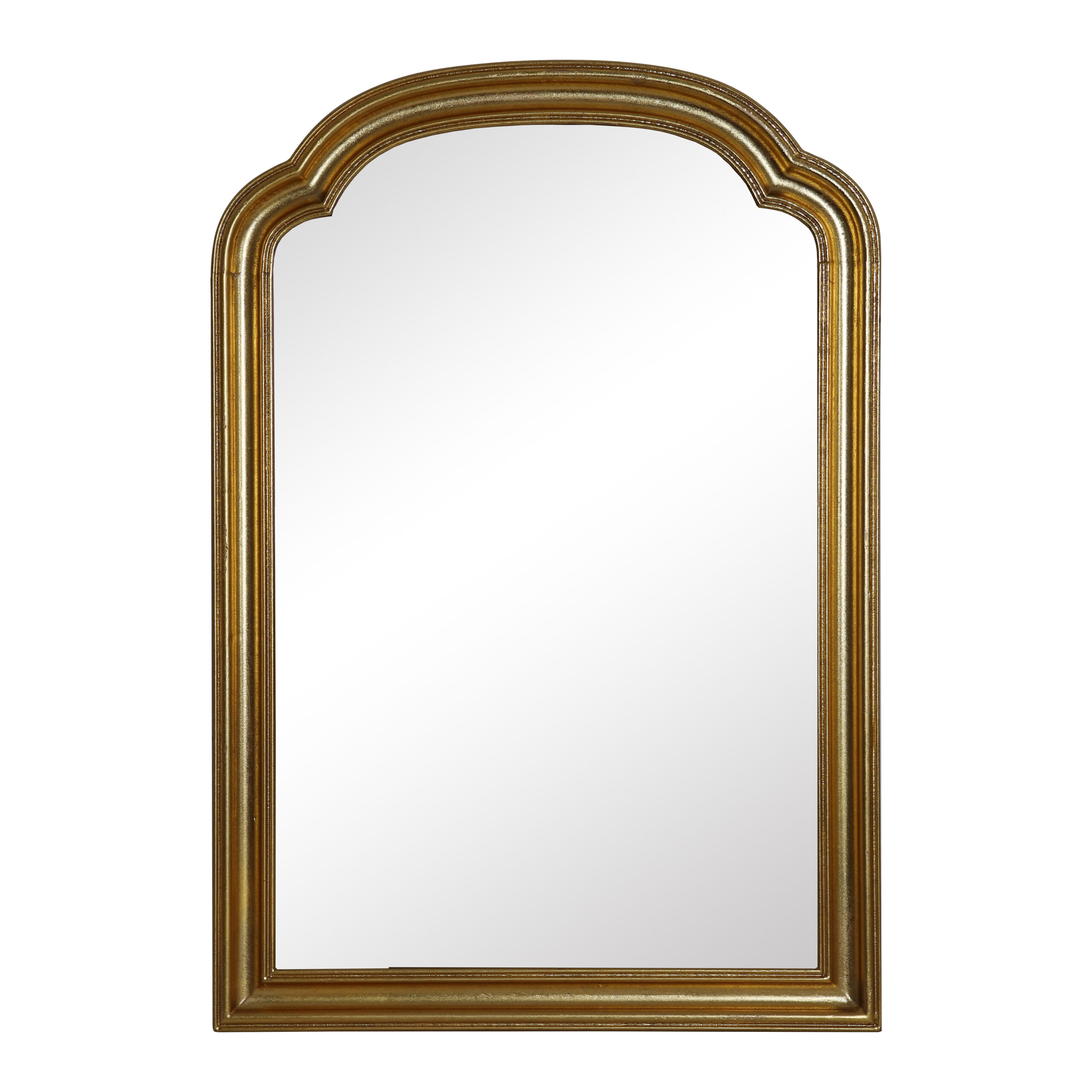
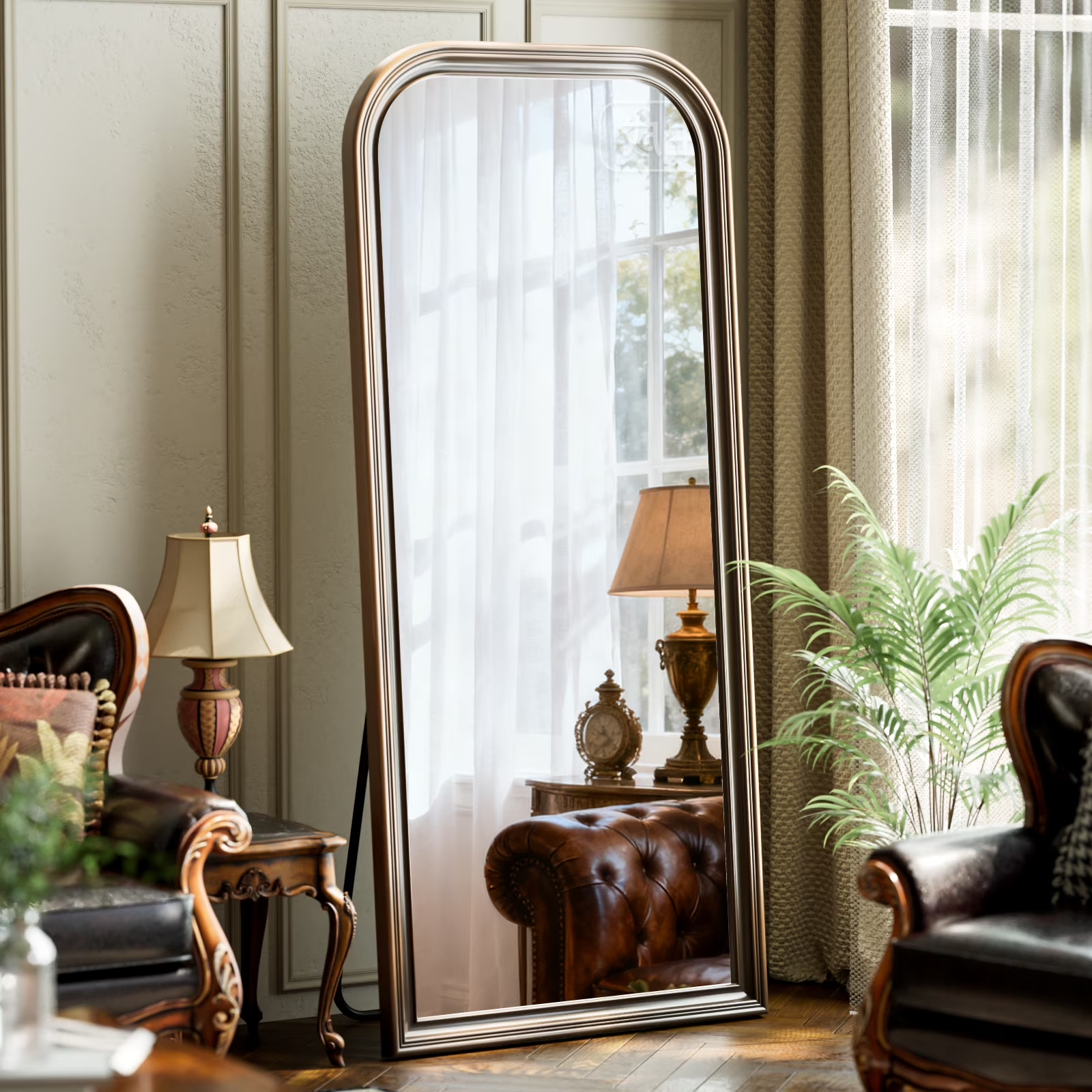
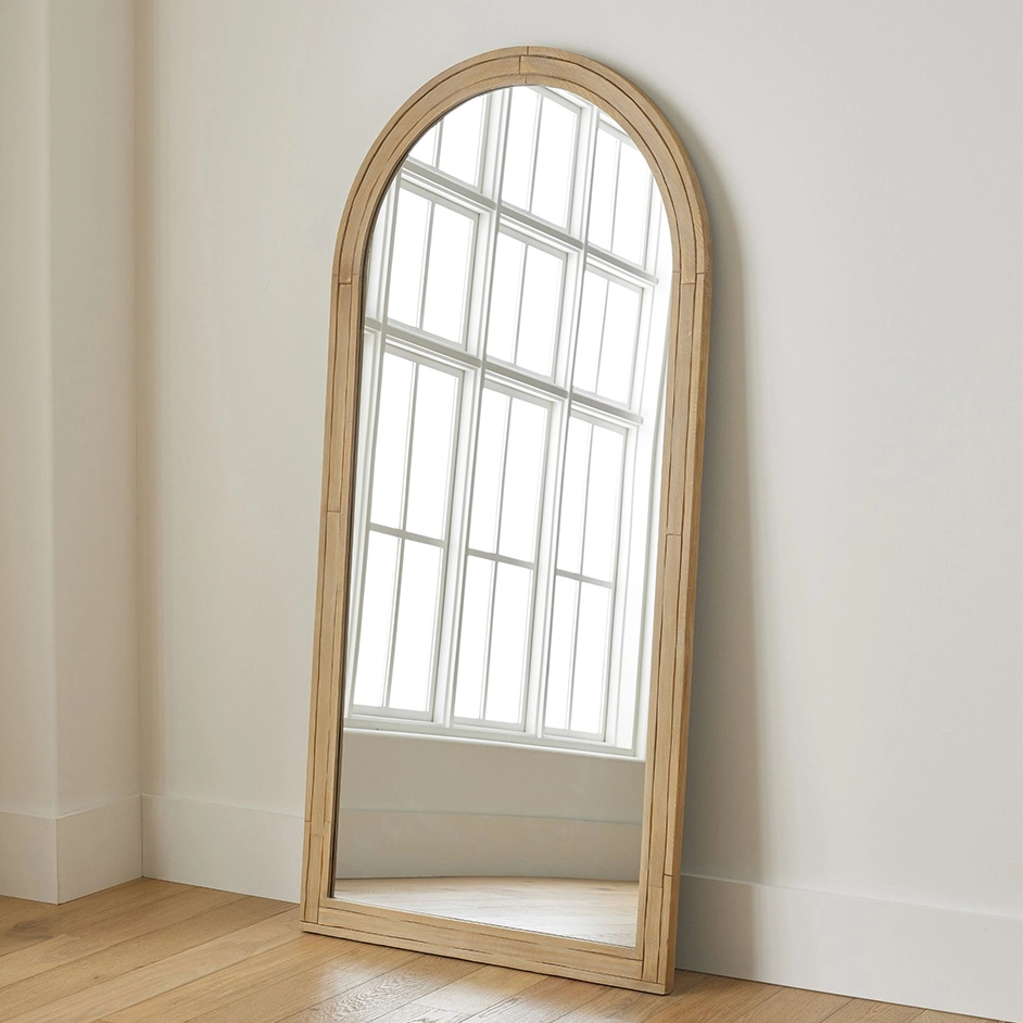
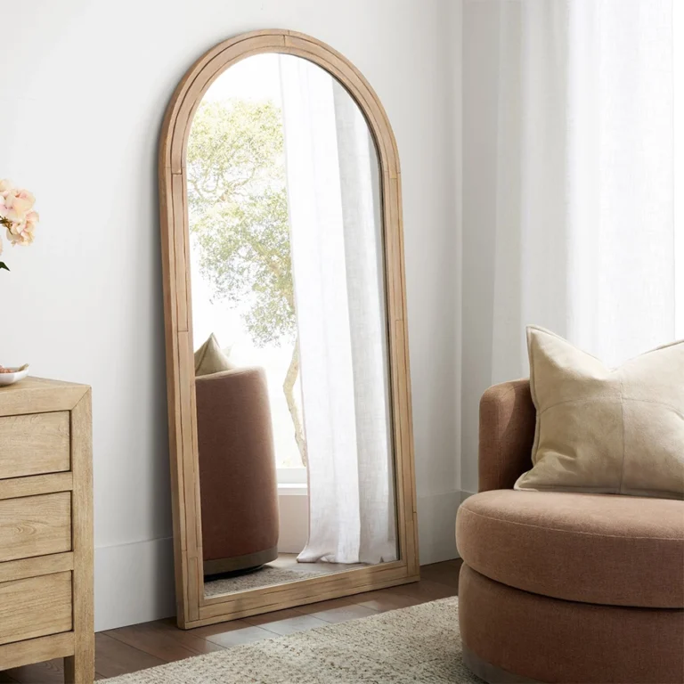
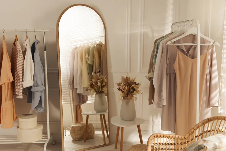
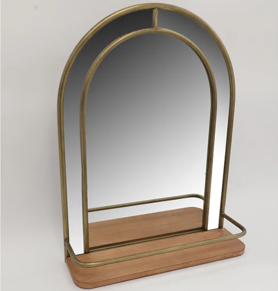
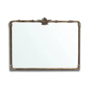
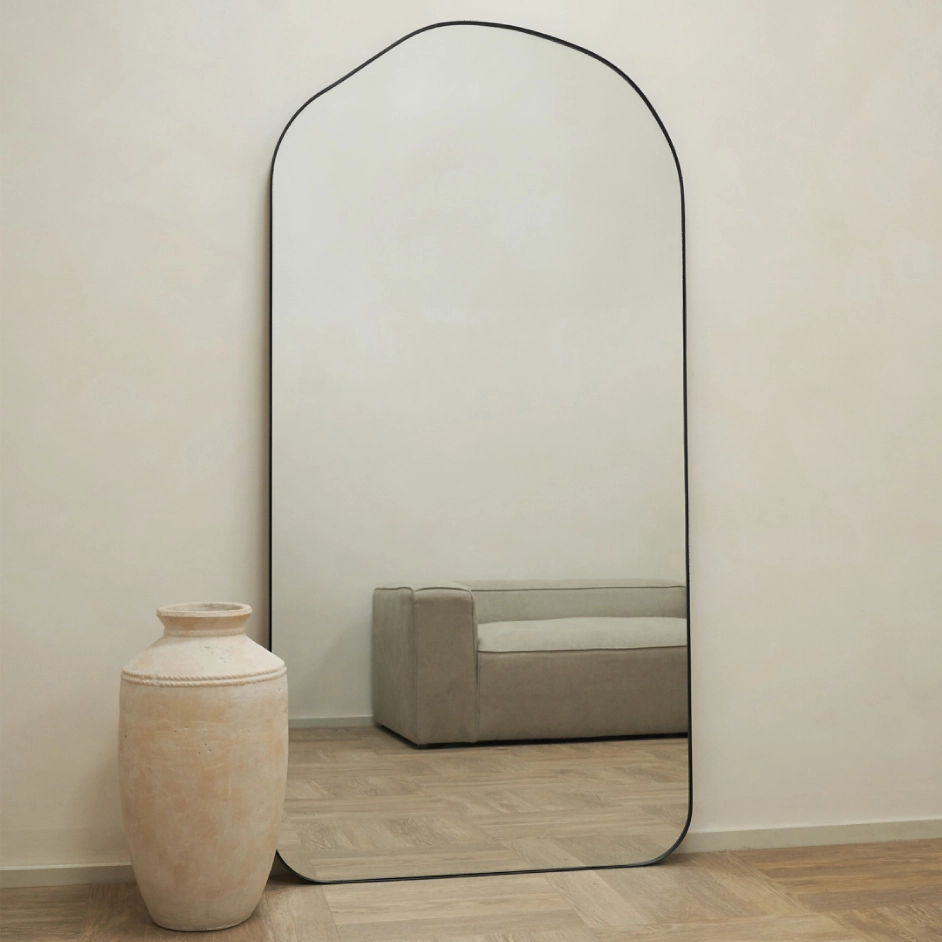
An Arched Mirror Softens a Space Fast. That Is Exactly Why Buyers Need to Source It Carefully. 2026-04-07
Some mirror styles sell because they are practical.
Some sell because they feel current.
And some sell because they change the emotional tone of a space almost immediately.
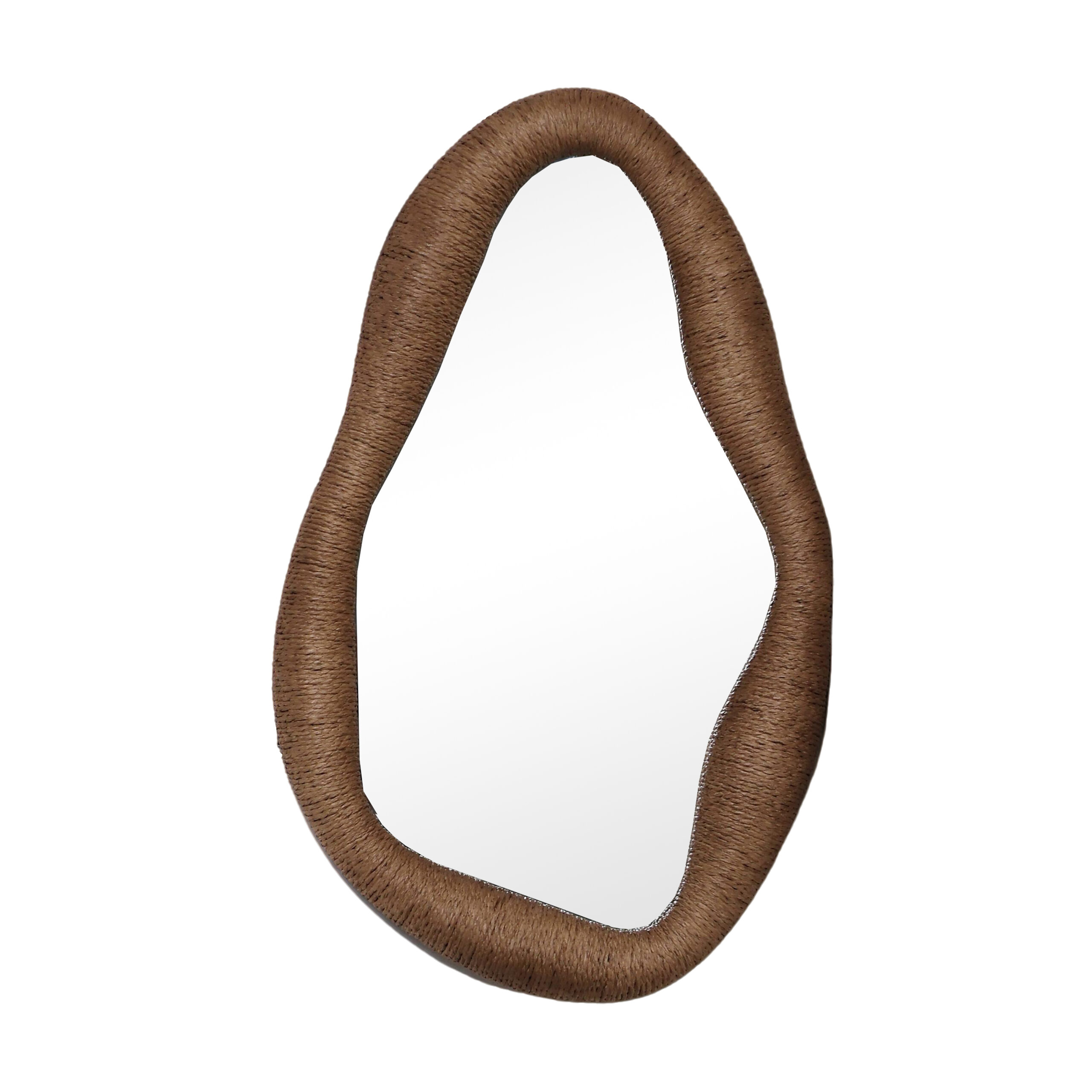
The arched wall mirror belongs to that third group.
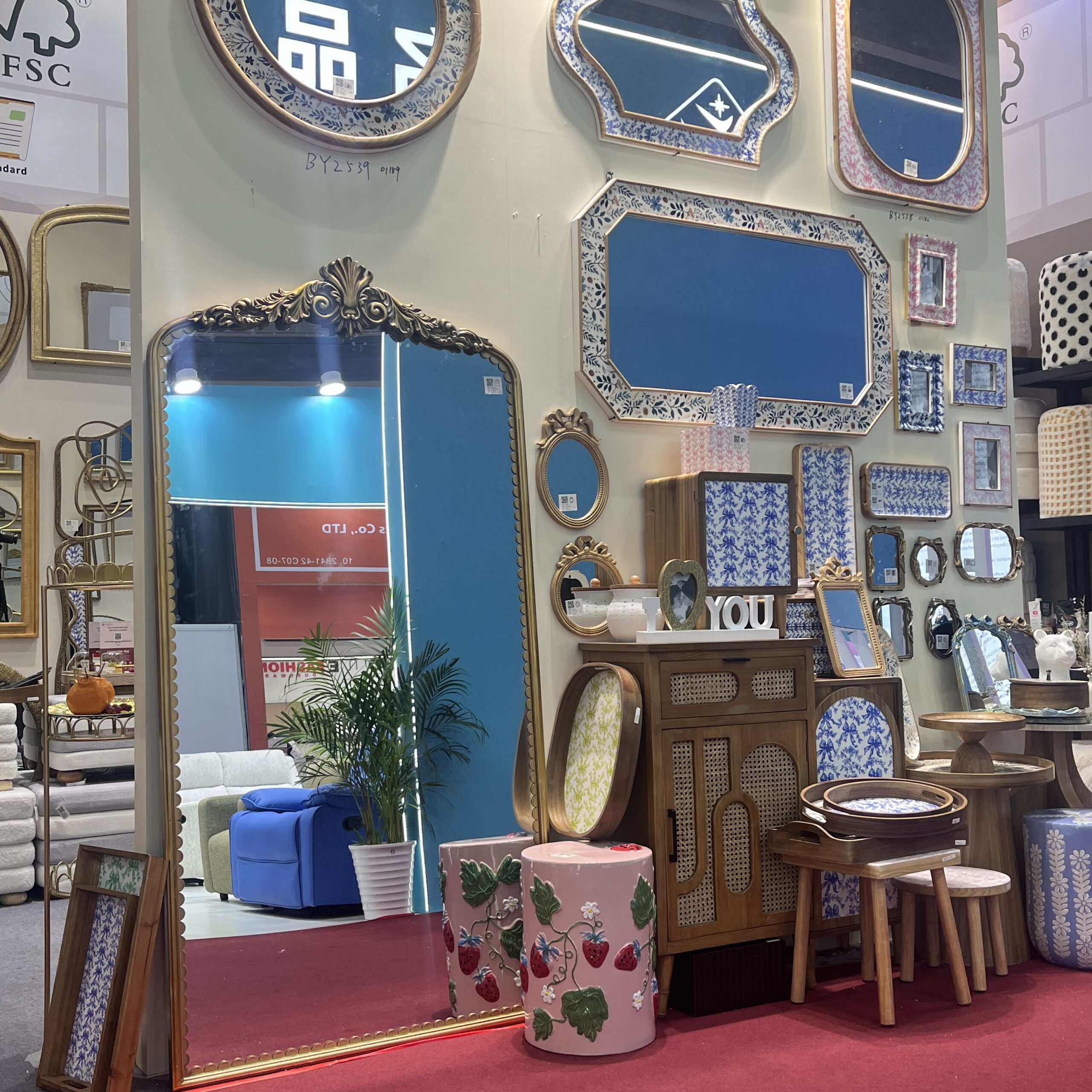
It softens a room. It creates height without feeling harsh. It introduces shape without overwhelming the wall. It can feel classic, modern, architectural, decorative, or calming depending on the frame and scale.
That is why arched mirrors continue to attract buyers across retail, design-led collections, hospitality, and residential projects.
But on the sourcing side, an arched mirror is not just another shaped mirror.
Its appeal depends heavily on proportion, finish, structure, and how well the supplier can repeat the visual balance that made the sample attractive in the first place.
That is why choosing an arched wall mirror manufacturer matters more than many buyers first assume.
The arch shape has broad commercial value because it works across multiple design directions without becoming too narrow.
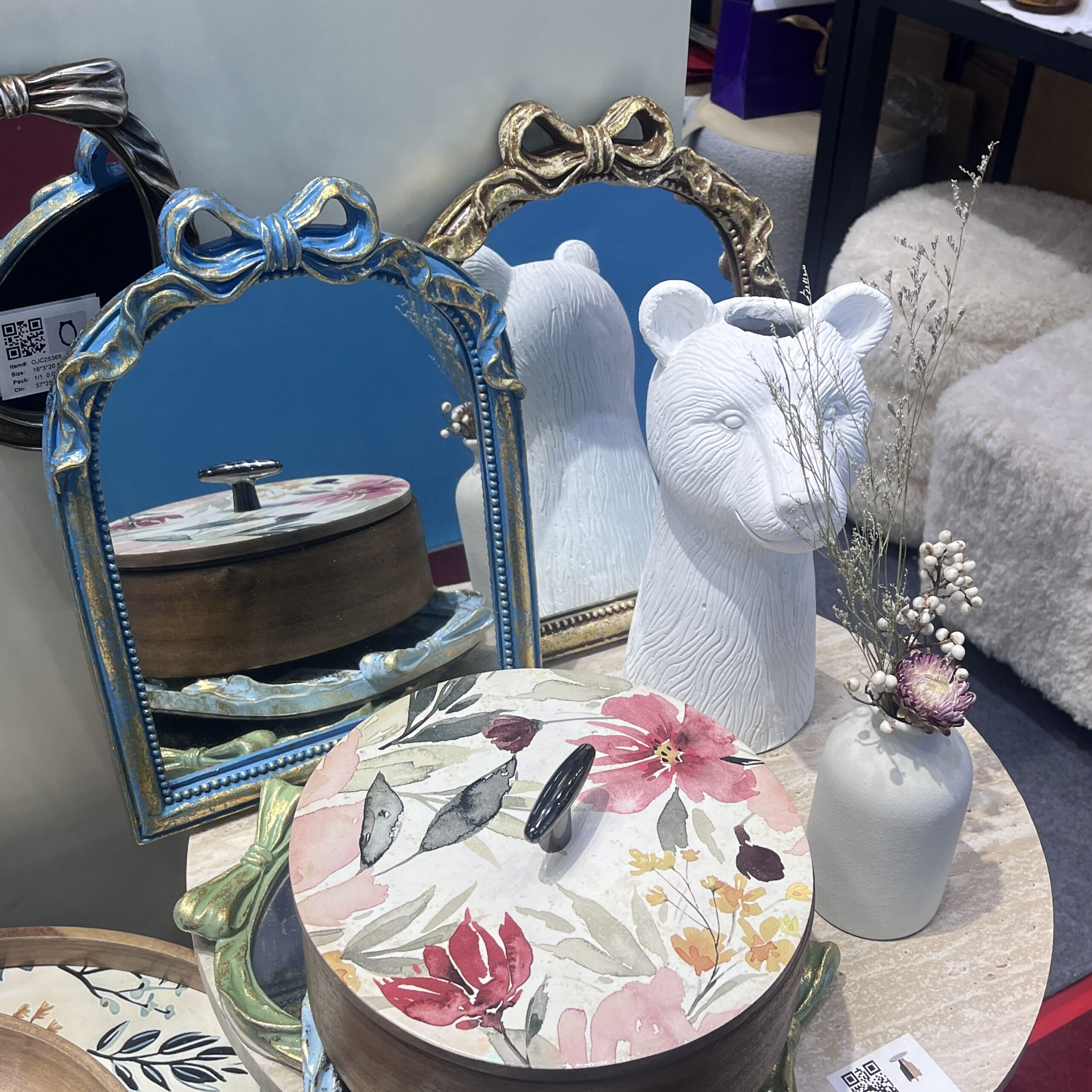
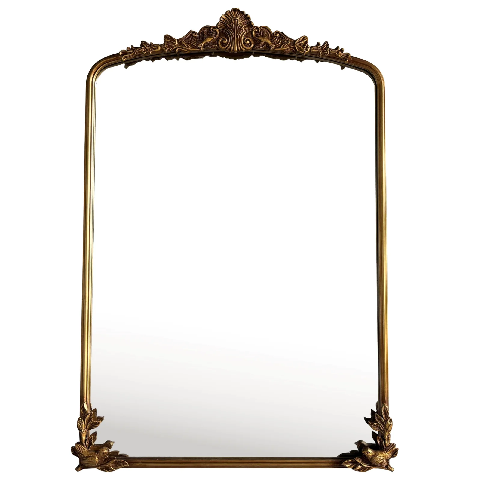
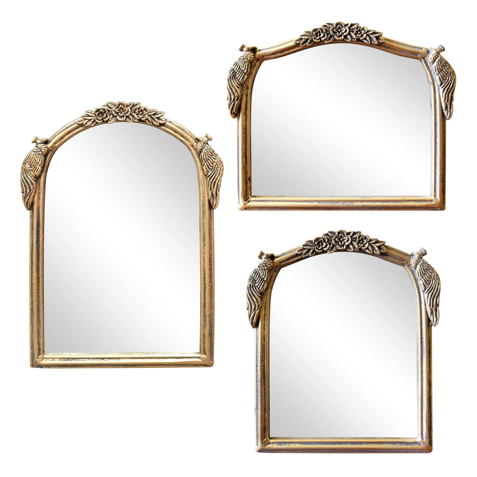
A slim black arched mirror can feel modern. A brass-framed arch can feel upscale. A wood-framed arch can feel warm and grounded. An oversized arch can feel like a statement piece. A softer, thinner arch can sit more quietly in a layered decor assortment.
That flexibility is commercially useful.
It allows arched mirrors to serve:
home decor retailers
furniture stores
private label collections
online assortments
apartment and hospitality projects
design-oriented import programs
In short, the style travels well across channels.
But the fact that arched mirrors are broadly attractive does not mean they are easy to source well.
Why the arch shape changes the sourcing logic
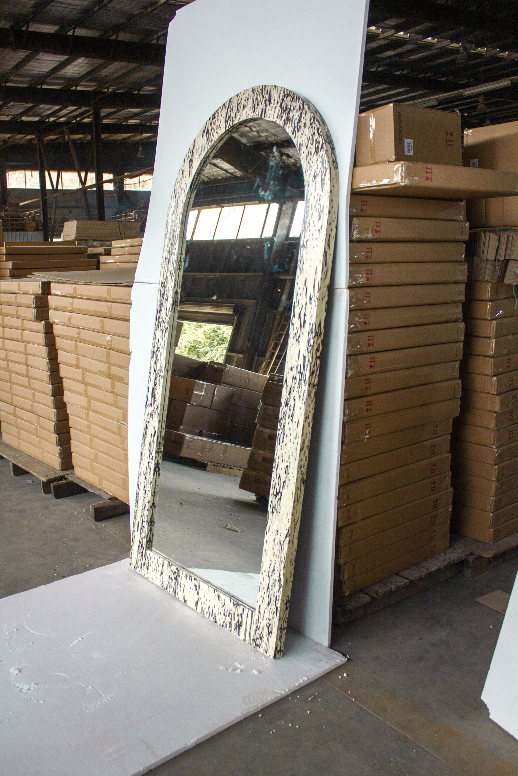
A rectangular mirror is easier to control visually. Its geometry is familiar, and minor deviations may be less noticeable.
An arched mirror is different.
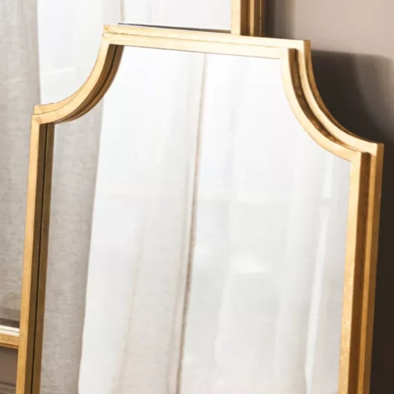
The curve is the product language.
If the top arc feels too flat, too tight, too wide, or slightly awkward in proportion, the product loses a large part of its appeal. What looks graceful in a good sample can look ordinary if the curve, frame, or scale is even a little off.
That is why buyers sourcing an arched mirror are not just selecting a shape. They are selecting a silhouette.
And silhouettes are more sensitive than many buyers realize.
The biggest mistake buyers make with arched mirrors
A common sourcing mistake is to treat arched mirrors like easy trend products.
The buyer sees a clean photo. The curve looks elegant. The frame tone feels marketable. The quote is acceptable.
So the item moves forward.
But later, problems begin to appear:
the arch proportion feels slightly different in bulk
the frame around the curve looks less refined than the sample
the finish loses some of its original depth
packaging does not protect the curved top properly
reorders look close, but not close enough
This is one of the central risks in arched mirror sourcing.
The product wins on first visual impression, but the supply system behind it is not yet stable enough to protect what made the product attractive.
What buyers are really looking for in an arched wall mirror manufacturer
When buyers source arched mirrors, they are usually trying to achieve more than simple style variety.
They want:
a shape with broad customer appeal
a silhouette that feels intentional, not generic
a finish that supports the arch visually
safer packaging for a more shape-sensitive product
a manufacturer that can hold visual consistency in reorders
a product that works as part of a real assortment, not just as an isolated pretty item
That means a serious arched mirror supplier should do more than provide designs.
They should help the buyer control how the arch behaves as a product program.
What a serious arched wall mirror manufacturer should help buyers control
A capable supplier should help buyers reduce uncertainty in five key areas.
1. Arch proportion
This is the most important part.
Not every arched mirror works just because it has an arch.
The arch can feel too narrow. Too tall. Too stiff. Too decorative. Too soft for the intended market.
A strong supplier should understand that proportion is the main commercial driver here. The buyer needs an arch that fits the target channel, room role, and price level.
2. Frame and finish alignment
The frame does not just surround the arch. It shapes how the arch is perceived.
A thick frame may make the product feel more substantial. A slim frame may make it feel lighter and more contemporary. A dark finish may make the silhouette feel architectural. A warm metallic tone may make it feel more decorative.
This is why the supplier should not treat finish as a late-stage choice. In an arched mirror, frame and shape work together.
3. Structural and packaging protection
Arched mirrors create different pressure points during packaging and transport, especially around the curved top.
If the packaging logic is too generic, the product becomes more vulnerable during shipping and handling. A strong supplier should understand that the mirror is not only fragile because it is glass. It is also sensitive because the silhouette itself must arrive intact and visually clean.
That means packaging should protect:
the curved top section
frame edges
corner and side stability
finish-sensitive surfaces
overall movement inside the carton
4. Channel fit
An arched mirror for a boutique decor assortment is not necessarily the same as one intended for a hospitality project or a broader wholesale line.
Some buyers want a more minimal arch. Some want a warmer, softer statement. Some want oversized presence. Some want a clean, volume-friendly SKU.
The supplier should understand the business role the mirror is meant to play.
5. Reorder continuity
Arched mirrors often work because the shape feels balanced. That means even small changes in the curve or frame can damage repeatability.
A serious manufacturer should be able to help the buyer protect:
the arch profile
frame consistency
finish tone
packaging discipline
overall product identity
Because a successful mirror should not become visually unstable as soon as it enters reorder stage.
Why arched mirrors are often more difficult than they look
Arched mirrors feel simple because the concept is easy to understand.
But sourcing simplicity and visual simplicity are not the same thing.
This category often becomes harder than expected because it depends on subtle balance:
the top curve cannot feel accidental
the frame cannot fight the shape
the size cannot weaken the silhouette
the packaging cannot ignore the arch
the reorder cannot drift visually
This is why buyers should avoid treating arched mirrors like fast catalog decisions. The style may look soft, but the sourcing work behind it should be disciplined.
Why arched wall mirrors work across both retail and project channels
Arched mirrors are versatile because they can add character without creating too much complexity in the room.
For retailers, they help build a softer and more design-aware assortment. For private label buyers, they create recognizable shape language. For project buyers, they can bring warmth and visual lift into bedrooms, entry areas, and shared spaces. For importers, they can serve as bridge products between decorative and volume-driven lines.
That makes the category useful, but again, usefulness does not remove sourcing pressure. It increases the importance of manufacturer quality.
Because when a style works across many channels, buyers want suppliers who can keep it stable across many order cycles too.
How TeruierMirror approaches arched wall mirror supply
At TeruierMirror, we do not treat an arched mirror as just a curve added to a standard mirror program.
We see it as a shape-led product that needs stronger visual discipline from the start.
That means asking questions such as:
What kind of arch suits the buyer’s market?
Should the mirror feel architectural, decorative, soft, or premium?
What frame width best supports the silhouette?
What finish makes the arch stronger instead of weaker?
How should the packaging protect the curved top?
Can the product be repeated without losing its visual balance?
This matters whether the buyer is sourcing:
black framed arched mirrors
gold arched wall mirrors
oversized arched mirrors
wood-framed arched mirrors
custom private label arch mirrors
project-ready decorative wall mirrors
The goal is not just to make an arched mirror.
The goal is to make one that still feels right after production, shipping, and reorder.
The better questions buyers should ask
When evaluating an arched wall mirror manufacturer, buyers should ask more than the basic sourcing questions.
Yes, ask about price, MOQ, and lead time.
But also ask:
How do you control the arch proportion in bulk production?
How do you make sure the frame supports the silhouette properly?
How do you package the curved top for safer shipping?
How do you protect finish consistency across reorders?
How do you adapt the arch style for different retail or project needs?
What usually makes arched mirrors look weaker in bulk, and how do you prevent that?
These questions reveal whether the supplier truly understands the category or is simply selling a shape that happens to be popular.
What buyers should really expect
A serious arched wall mirror manufacturer should do more than offer arch-shaped products.
They should help buyers source arched mirrors with stronger silhouette control, better frame coordination, better packaging protection, and better long-term repeatability.
Because in this category, the shape is the value.
And the supplier plays a major role in whether that value stays refined or becomes diluted.
That is what buyers should really care about.
Not just whether the mirror has an arch. But whether the arch still feels right when the product becomes a real business item.
A Mirror Can Look Beautiful in Photos and Still Fail in Shipment: The QC Checkpoints Buyers Should Review Before Approval 2026-04-02
A mirror can look perfect in a product photo and still become a problem the moment it reaches the warehouse.
That is the mistake many buyers make.
They approve the style. They approve the finish. They approve the sample photo. But they do not approve the product as a repeatable shipment-ready item.
For decorative wall mirrors, floor mirrors, and full-length mirrors, the real question is not only whether the mirror looks attractive. The real question is whether it can survive production, packing, transport, unloading, and final display without creating complaints, replacements, or margin loss.
That is why mirror sourcing should always include clear mirror QC checkpoints.
Why mirror quality control matters more in traditional mirrors
With traditional mirrors, buyers are not only buying reflection. They are buying finish quality, structural consistency, and visual trust.
A small defect in a metal frame corner can lower the entire product grade. A slight wave in the mirror surface can make a full-length mirror feel cheap. A weak hanging bracket can turn a decorative wall mirror into a liability. A poor carton structure can destroy a floor mirror before it even reaches the customer.
In other words, traditional mirrors are highly visual products—but they fail through execution.
That is exactly why a proper mirror inspection checklist matters.
1. Start with the mirror surface, not the styling
The first checkpoint is the reflection itself.
Before discussing frame color, shape trend, or decorative details, buyers should inspect the glass surface carefully.
Look for:
reflection distortion
scratches
pinholes
black edge risk
cloudy spots
inconsistent mirror backing
visible defects near the perimeter
This is especially important in full-length mirror QC, because customers notice body distortion immediately. A mirror may still look “acceptable” on a warehouse floor, but once it is used in a bedroom, fitting room, or retail display, distortion becomes obvious.
If the reflection does not feel stable, the mirror is not ready.
2. Check frame construction as a value signal
In traditional mirrors, the frame is not a secondary part. It is often the reason the buyer chose the item in the first place.
For metal-framed mirrors, inspect:
corner welding
joint alignment
coating consistency
brushed finish direction
surface scratches
plating uniformity
For wood-framed mirrors, inspect:
color consistency
veneer matching
corner joining quality
paint coverage
rough sanding marks
edge smoothness
This is where a strong wall mirror quality control process becomes important.
A wall mirror is often judged from distance first and up close second. If the frame looks good from afar but feels rough, uneven, or poorly aligned when handled, the buyer loses confidence immediately.
3. Hanging hardware is part of product quality
A mirror is not finished when the front side looks good.
The back side decides whether it can actually be sold safely.
Every decorative mirror inspection checklist should include:
D-ring placement
hook alignment
screw fixing
backboard attachment
support strength
horizontal/vertical hanging readiness
stability under actual weight
For heavy decorative wall mirrors, buyers should also confirm whether hardware positioning matches the center of gravity. A mirror that hangs unevenly or feels insecure will create installation complaints very quickly.
For floor mirrors and leaning mirrors, inspect the support leg, opening angle, hinge stability, and anti-tip logic. These are not small details. They directly affect retail usability and return risk.
4. Batch consistency matters more than sample beauty
A good sample proves possibility. A good batch proves capability.
This is where many suppliers break down.
The approved sample may look excellent, but the batch may show:
inconsistent frame tone
different gold or black finish shades
uneven bevel effect
changing mirror brightness
different corner craftsmanship
unstable packaging method
So before shipment approval, buyers should compare production against the approved sample in a structured way.
That is what real mirror QC checkpoints are for.
5. Packaging should be inspected as seriously as the mirror itself
For mirrors, packaging is not an afterthought. It is product protection.
This is especially true for large wall mirrors and floor mirrors. A good mirror can still arrive broken if the packaging system is weak.
A practical floor mirror packaging inspection should include:
corner protection strength
front and back panel protection
carton wall strength
internal movement control
shock absorption materials
carton fit to product size
clear handling and orientation marks
For large-format mirrors, the packaging should never feel generic. If the carton design looks like a standard box applied to a fragile oversized item, the buyer should assume avoidable risk exists.
6. Dimensional control should be part of QC
The mirror may be stylish, but if the dimensions drift, the product loses commercial value.
Check:
total height and width
frame width consistency
thickness stability
diagonal balance
arch or curve symmetry
pair matching for set items
This is often ignored in basic inspections, yet it is one of the easiest ways to detect whether a factory is controlling production well or simply assembling attractive samples.
7. A good buyer asks quality questions before shipment
Before approving mirror production for shipment, buyers should ask:
Has reflection distortion been visually checked?
Are all frame corners aligned consistently?
Does the finish match the approved sample batch-wide?
Has the hanging hardware been tested?
Has the packaging been adjusted for this mirror size?
Are pre-shipment photos available for front, side, back, and packed condition?
What defects are considered rejectable?
How will consistency be controlled in reorders?
These questions do not make the buying process slower.
They make it safer.
8. What strong mirror QC says about a supplier
A supplier that only shows design understands selling.
A supplier that shows process understands repeat business.
That is the difference buyers should care about.
At Teruier, we believe traditional mirrors should be managed not just as décor products, but as deliverable products. A mirror must not only look right in a collection. It must also arrive right, hang right, and reorder right.
Because for buyers, the shipment is not successful when the mirror looks beautiful in a brochure.
The shipment is successful when the mirror arrives with confidence built in.
Generally speaking, our order requirements are as follows: the minimum order quantity (MOQ) for large items is 50 pieces, for regular items it is 100 pieces, for small items it is 500 pieces, and for very small items (such as ceramic decorations) the MOQ is 1,000 pieces. Orders exceeding $100,000 will receive a 5% discount. The delivery timeline is determined based on the specific order quantity and production schedule. Typically, we are able to complete delivery within two months.


Leave a Reply